


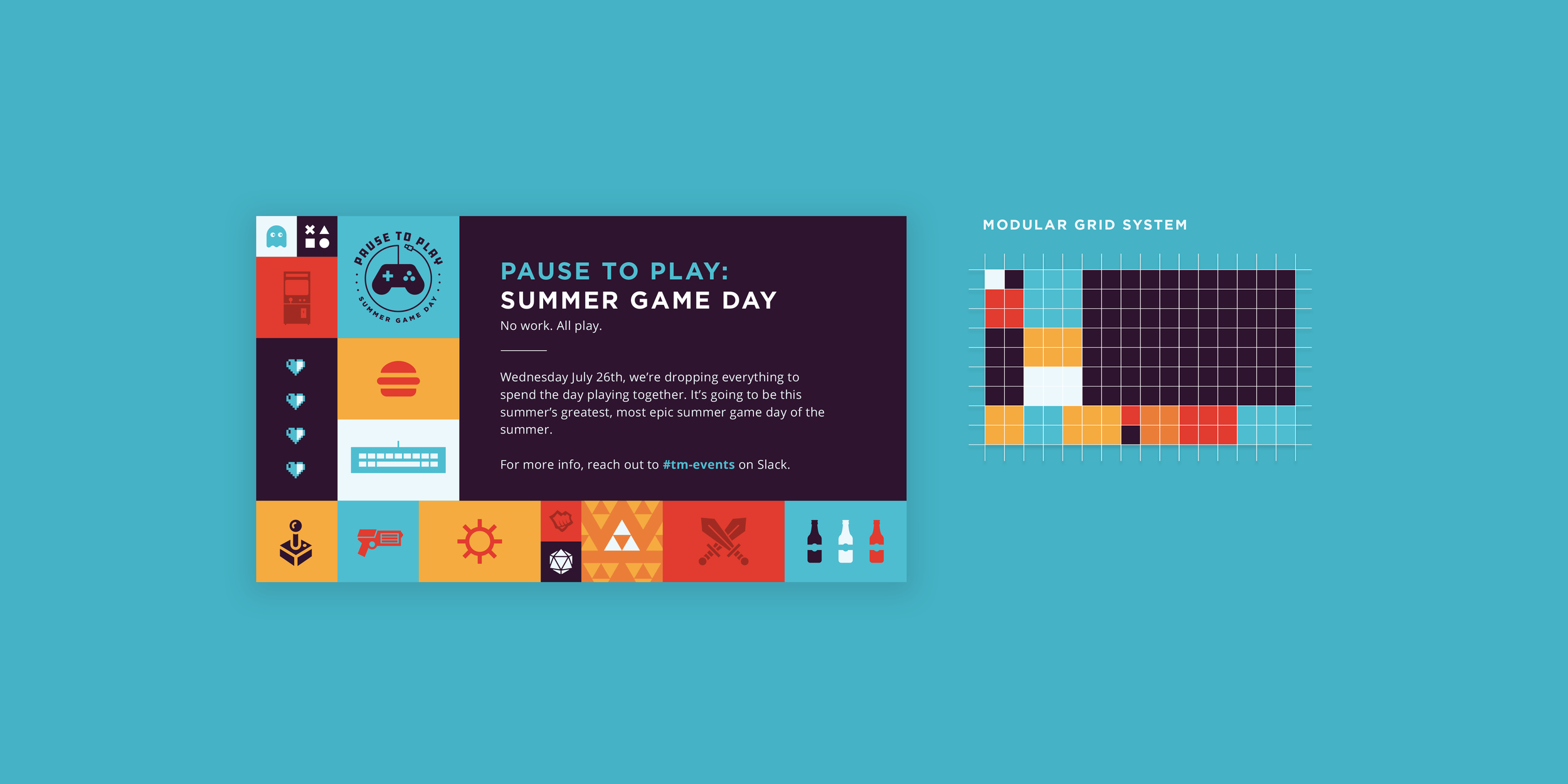

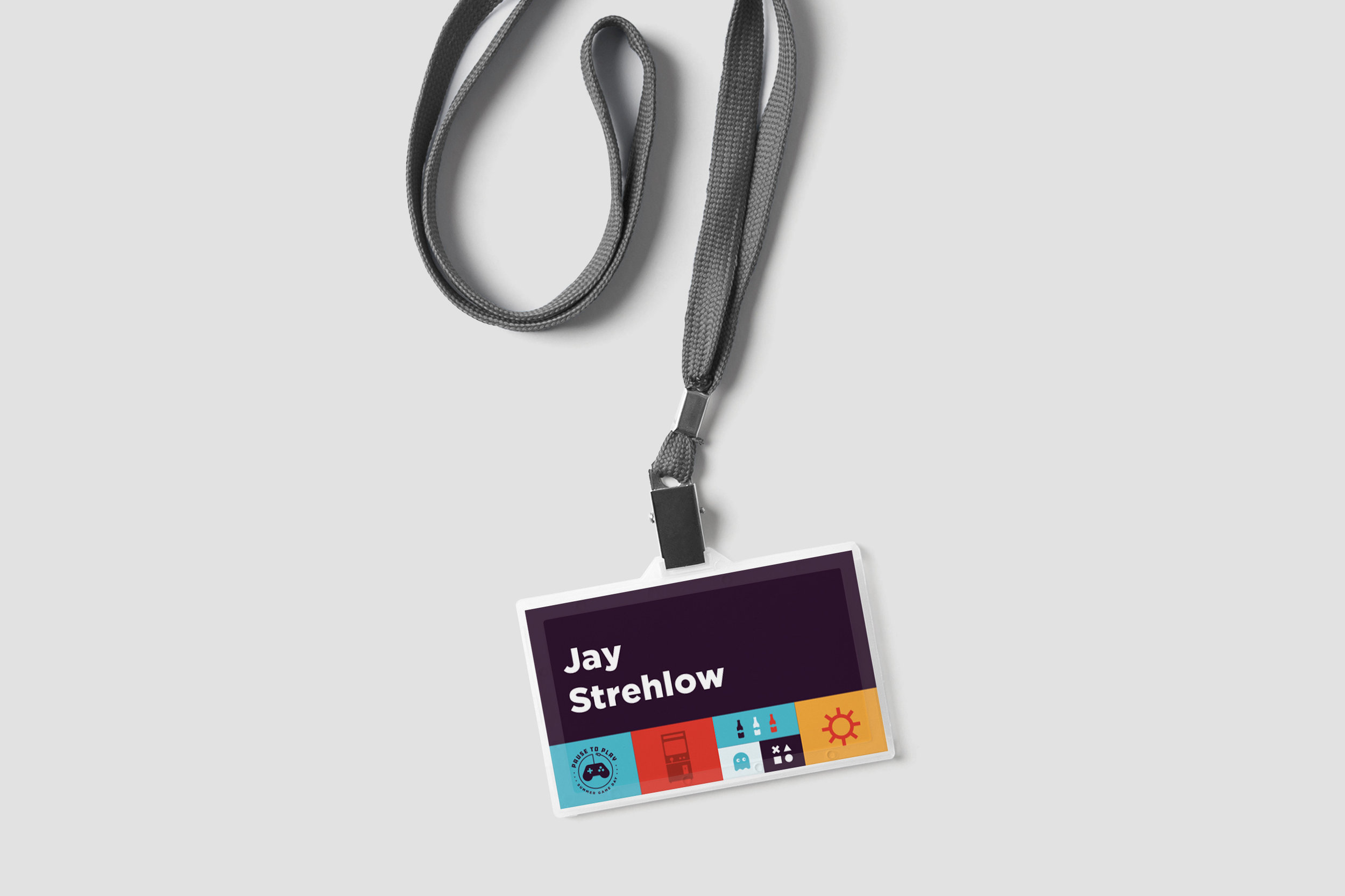


Riot Games has a great company culture. They asked me to create an identity for an event they hold every year called "Pause to Play". On this day the entire company takes a break from all their hard work to enjoy some beer, food, and games of all kinds.
The branding needed to represent the activities offered during the event while conveying the young, fresh company culture they interact with everyday. I used a bright color palette and playful interaction to keep the visuals interesting while allowing the iconography to help explain what the day was about without reading too much.
The grid layout gave the perfect amount of structure for the iconography to stand out and act modularly. I was able to balance compositions using modular designs while only affecting scale. This should allow the brand to be very versatile and ideally never repeated through production.
Another perk of working at Riot is being involved in their community outreach program. The entire company, worldwide, stops and volunteers in their respective cities educating students. Below is a branding I recently made for this event.
The brief called for a community vibe while still feeling modern and tech-focused. I used soft green and blue hues to keep it looking fresh and anchored the palette with a dark blue to give some contrast. The line art style provided a much needed cohesiveness and overall clean aesthetic.
Because it is a community outreach program, it wouldn’t need an ornate identity so I thought we’d go a bit more on the logo and keep the branding clean and simple. Fun project!