


Best Restaurant Interactive Customer Experience - 2019 ICX Summit
Taco Bell wanted to bring their customers a modern ordering experience that allowed for more personalization and brand loyalty. I created new UI & a streamlined UX improving wait times, in-store experience, and simplified their checkout process. This project recently was recognized at the 2019 ICX Summit and won the award for “Best Restaurant ICX”. Read more about the summit here.
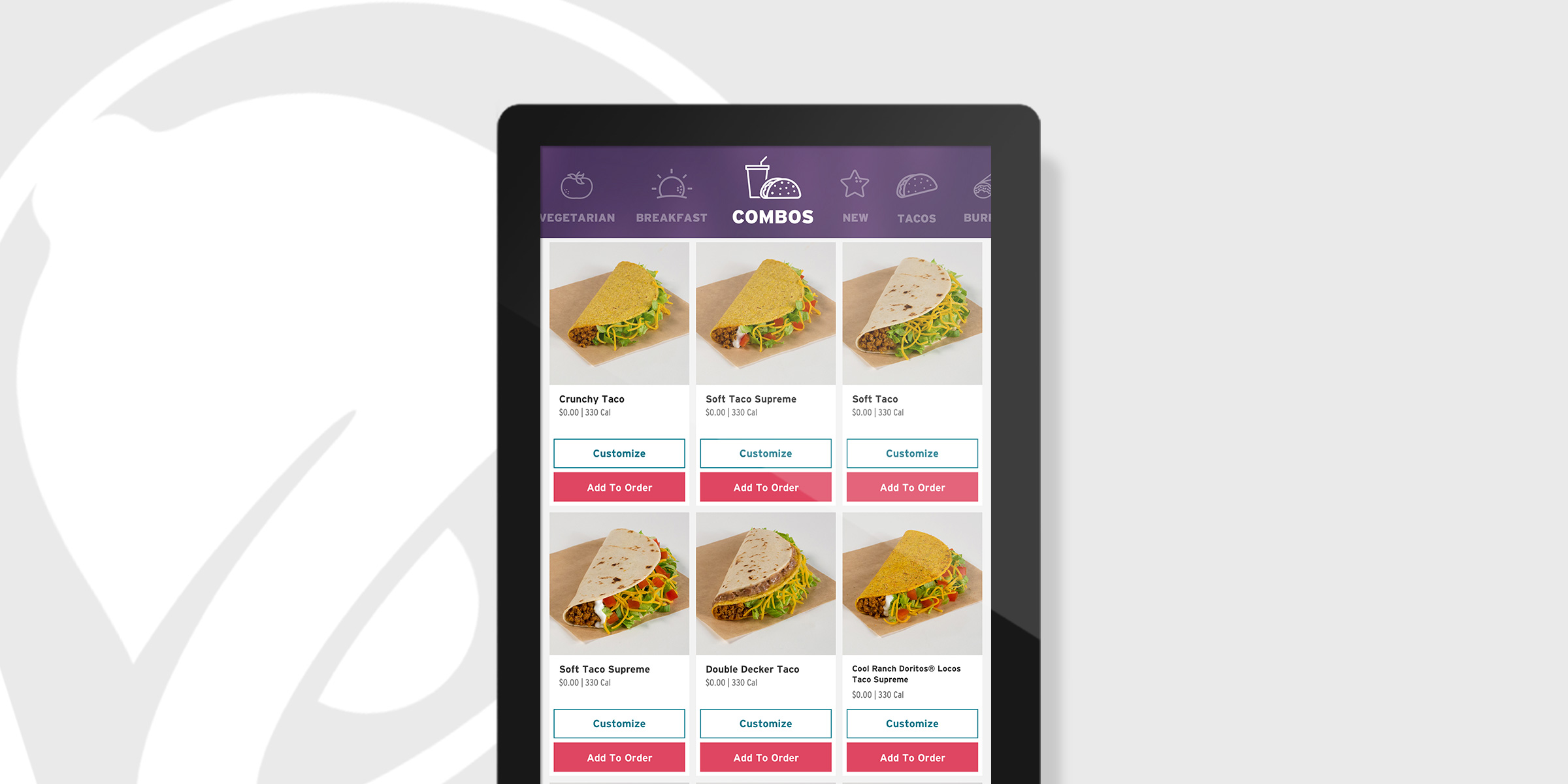
Solving this problem meant taking into account a very large, very, customizable menu and making the ordering process clear and quick for the user. Their initial release was made up of a horizontal layout which allowed the user to view their cart at all times and shuffle through a large, complicated hierarchy of menu items. I solved this by first switching the entire device mount to a vertical layout and secondly having an easily digestible flow, page-by-page, that gently nudges the user towards checkout.
It was important to the client that customizations, though extra effort on back-of-house, be at the forefront of the interface. Most users customize their order so it was imperative this be fast and easy to keep ordering quick and wait lines short.
Micro-interactions allowed important UI features to live off-screen but not be missed but the user. This freed up valuable real-estate to display those delicious tacos and encourage loading up that cart.
The Taco Bell branding is anything but boring. Because of this, one of the most important undertones of the project was stakeholder education around utilitarian experiences and information architecture. I needed to interpret their recently refreshed branding with a lens of structure and function.
The color theory was back by their brand guidelines but devised to allow for a clean palette, that let the product images stand out and still allowed for multiple calls-to-action on every page. The palette leans on their flagship warm gradient to highlight large decisions within the flow while incorporating teal hues to hint at customization options.